I've said I'm going to endure the pain of looking at GUI dialect code on a weekly basis, and my first attempt to do so was 2 weeks ago, so I guess I am overdue...
Here is some code from an Issue in Red's GitHub: "VID on Ubuntu Doesn't Right Align"
view [
  group-box 3 [
    text blue white right "Before Stream: "
    beforeStreamDisplay: text blue white "None"
    button "Select file" [beforeStreamDisplay/text: (to string! request-file)]

    text blue white right "Delta Stream: "
    deltaStreamDisplay: text blue white "None"
    button "Select file" [deltaStreamDisplay/text: (to string! request-file)]
  ]
  panel 3 [
    text blue white right "Before Stream: "
    f-3: text blue white "None"
    button "Select file" [f-3/text: (to string! request-file)]

    text blue white right "Delta Stream: "
    f-4: text blue white "None"
    button "Select file" [f-4/text: (to string! request-file)]
  ] return
]
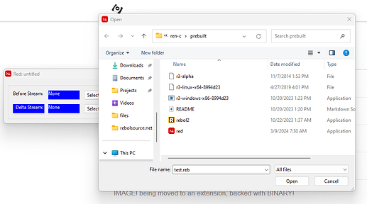
The result of that is:

I tried the code on my local Red EXE on Windows, and it did work.
Let's Try And Unpack That
So it says view [...]. My understanding is that VIEW's job is to handle a tree of layout objects. So I'm going to guess that the LAYOUT instruction is implicit, and that will do the same thing as view layout [...]
![]() YES ... I am correct
YES ... I am correct
What's The Point of the RETURN at the End of The Layout?
I've never liked "RETURN" being reused to mean "end current row and start a new one". Though it's a sort of in-your-face "the dialect can use words however it wants" example.
But the RETURN in this example has nothing that comes after it. I'm assuming that if you delete that RETURN it has no effect.
![]() YES ... as far as I can tell removing it has no effect. But it seems to be put there intentionally. Perhaps it's just a habit people get into in order to say "hey, this is as wide as this layout should be, if you're going to add any more stuff to this example it should be on a new 'line'."
YES ... as far as I can tell removing it has no effect. But it seems to be put there intentionally. Perhaps it's just a habit people get into in order to say "hey, this is as wide as this layout should be, if you're going to add any more stuff to this example it should be on a new 'line'."

What's The Number After the Panel or Group-Box?
So at the top level here, you've got two panel thingies. One of these uses a group box and the other doesn't.
view [
  group-box 3 [...]
  panel 3 [...]
  return
]
Hence I guess that GROUP-BOX is derived from or otherwise inherits its PANEL-ness?
Although what you're getting here are grids, they're passing just 3 instead of 3x2. I guess because the 3 is enough to say how many sub-elements you're going to have until kicking it over to a new row. So if you left it off, that would just put everything all in a horizontal line?
![]() YES ... well looky there, I guessed right.
YES ... well looky there, I guessed right.
So supplying the INTEGER! argument to GROUP-BOX and PANEL saves you on the need to put a "RETURN" when you want there to be a break.
What Other Parameters Do PANEL and GROUP-BOX Have?
The Red Documentation for VID tells us:
panel <options> [<content>]

<options> : optional list of settings for the panel.
<content> : panel's VID content description (block!).
...and...
group-box <divider> <options> [<body>]

<divider> : optional number of row or columns (integer!).
<options> : optional list of settings for the panel.
<body>    : panel's VID content description (block!).
Uh, okay. Well it seems to me that PANEL was willing to take the "divider" INTEGER! even though it doesn't say it takes it. And there's no mention of what <options> we have, here. Rebol Documentation for VID isn't much more helpful.
(But it seems that whatever <options> we do have, it would be confusing if any of them involved blocks.)
They set the color on TEXT with just naming colors after it (background, foreground). Could I do that, e.g. group-box 3 orange purple and get the box outline to be drawn in purple on an orange background? If I removed the colors from one of the texts, would it too be purple on orange?
![]() HALF-RIGHT ... background is orange, but it seems to ignore the purpleness entirely. Neither the line drawing the group box nor the text inside the panel inherited the purple.
HALF-RIGHT ... background is orange, but it seems to ignore the purpleness entirely. Neither the line drawing the group box nor the text inside the panel inherited the purple.

What If I Gave an Invalid Color?
Perhaps it doesn't know purple and wanted magenta or something, and just didn't give an error. What happens if I give it mispelled colors, like group-box 3 ornage grene?
One would hope it would fail. But would it fail at the LAYOUT level, or would LAYOUT build a structure that VIEW would choke on?
I'd idly guess that VIEW expects not color WORD!s but to have things resolved to TUPLE!s in the layout objects, so I'm going to guess that GET-ting the words in LAYOUT production would fail... so I'll just try that in a LAYOUT with no VIEW.
![]() YES ... I am good at this guessing game.
YES ... I am good at this guessing game.
  red>> layout [group-box 3 ornage grene [...]]
  *** Script Error: VID - invalid syntax at: [
      ornage grene [
         text right "Before Stream: " beforeStreamDisplay: text blue white
BUTTON Runs The Code In The Block When Pushed
Okay, in the "fairly obvious" department, I am guessing that if I push the button, it will run the code in the block.
![]() YES ... but don't think I deserve any particular gold star for that insight.
YES ... but don't think I deserve any particular gold star for that insight.
The file selection box is the one provided by the OS. It is modal--you can't move the Red window around or interact to it while the dialog is up. Multiple selection of files is not enabled by default. The options for REQUEST-FILE are:
REFINEMENTS:
     /title       => Window title.
        text         [string!]
     /file        => Default file name or directory.
        name         [string! file!]
     /filter      => Block of filters (filter-name filter).
        list         [block!]
     /save        => File save mode.
     /multi       => Allows multiple file selection, returned as a block.
(I'll mention that Ren-C has REQUEST-FILE for Windows and Linux/GTK. It was in the Atronix build and I retooled it to leverage the libRebol API pretty nicely, and improved some things about it. But I don't use it for anything.)
Okay, I'm Bored
I think I pretty well understand this example.
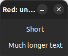
Looking at the original issue, though, I'm empathetic to SkySpiral7's complaint.
If you write:
view [
   text right "Short" return
   text right "Much longer text"
]
And get:

Then that seems wrong to me. If something that simple doesn't work how you'd expect it to, what good is this thing?
And it seems like something more semiotic could be used here for RETURN.
view [
   text right "Short"
   |
   text right "Much longer text"
]
If single bar is too slight or used for something else, maybe double bar.
view [
   text right "Short"
   ||
   text right "Much longer text"
]
Dashes? Equals?
view [
   text right "Short"
   ===
   text right "Much longer text"
]

